Chapter 2: Dashboard Navigation
Chapter Overview
What You'll Learn:
- Understanding the dashboard layout and main components
- Navigating the left sidebar menu
- Using the header bar and quick actions
- Accessing user profile and settings
- Switching between agencies (multi-agency users)
- Switching between branches (multi-location agencies)
- Understanding system alerts and toast notifications
Time to Complete: 10-15 minutes
Who Should Read This: All users - this is essential navigation knowledge for using the system
Prerequisites: Complete the Sandbox Signup chapter (account created and logged in)
2.1 Dashboard Layout Overview
After logging in, you arrive at the main Dashboard - your central hub for all system activities.
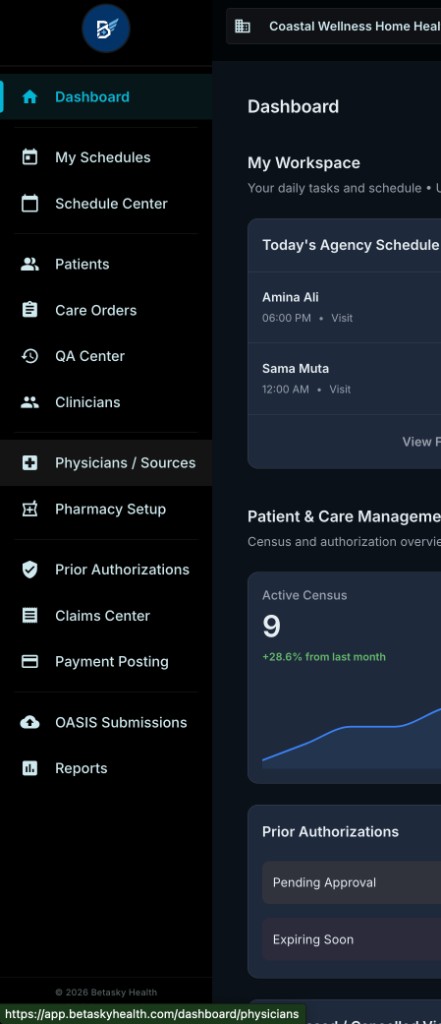
Screenshot 1: Complete dashboard showing all major components
Main Components
The dashboard consists of four primary areas:
- Left Sidebar - Main navigation menu (always visible)
- Top Header Bar - Agency selector, user info, quick actions
- Main Content Area - Dashboard widgets and information
- Sandbox Banner (when in sandbox mode) - Orange warning at very top
Let's explore each component in detail.
2.2 Navigation Menu Structure (Left Sidebar)
The left sidebar is your primary navigation tool. It remains visible on all pages for quick access to any feature.
Sidebar Layout
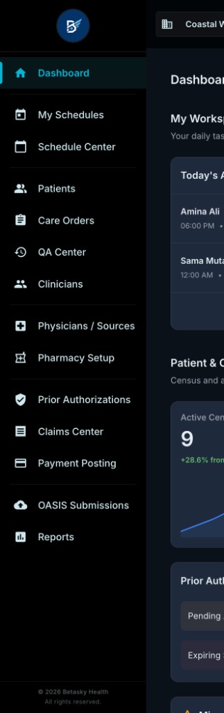
Screenshot 2: Left sidebar showing agency logo and all menu items
Agency Logo
At the top of the sidebar, you'll see:
Custom Agency Logo (if uploaded)
- Your agency's logo appears in a circular icon
- Displays your branding throughout the system
- Click to return to dashboard (home)
Default Betasky Logo (if no logo uploaded)
- Shows the Betasky "B" logo
- Indicates no custom logo has been set
- Can upload logo via Settings → Agency Settings
💡 TIP: Upload your agency logo to personalize the interface for your staff. This appears throughout the system and on printed documents.
Complete Menu Structure
The sidebar contains all main navigation items. Let's go through each one:
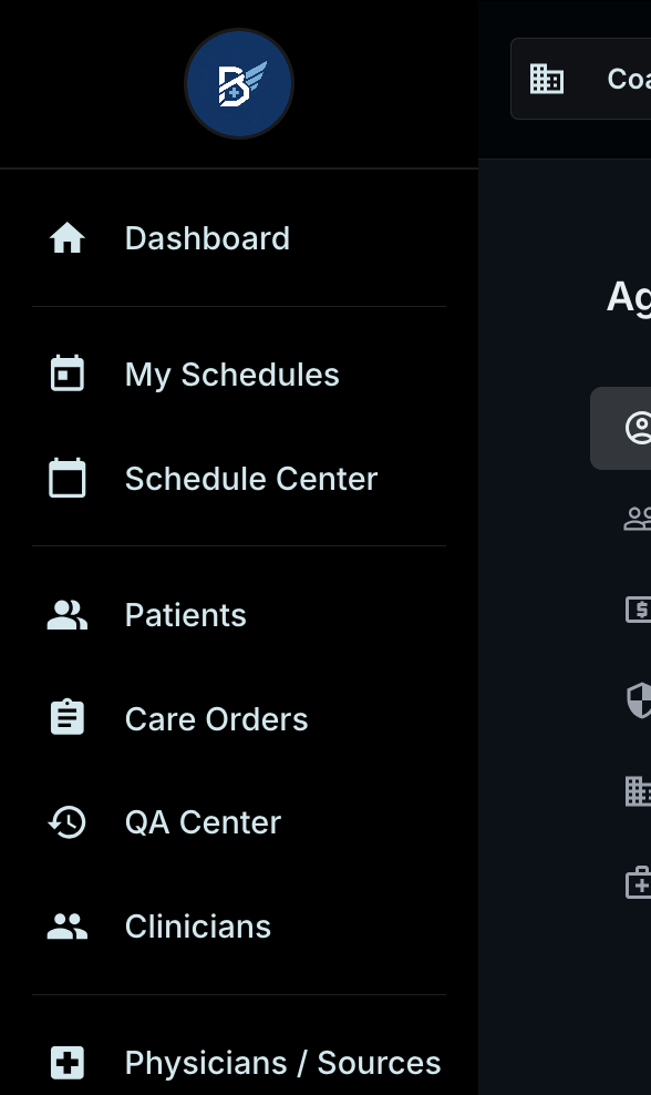
Screenshot 3: Sidebar with large icons showing all menu items
Primary Navigation Items
1. 🏠 Dashboard (Blue highlight when selected)
- Your home page
- Shows daily tasks, schedules, and key metrics
- Always the first item
2. 📅 My Schedules
- Your personal schedule (clinician view)
- Shows your assigned visits
- Calendar view of your appointments
3. 📅 Schedule Center
- Agency-wide scheduling board
- Assign visits to clinicians
- Drag-and-drop scheduling
- View all agency visits
4. 👥 Patients
- Patient list and management
- Add new patients
- View patient profiles
- Access intake forms
5. 📋 Care Orders
- Episodes of care (60-day periods)
- View all care orders by status
- Create new episodes
- Initiate recertifications
6. ✓ QA Center
- Quality assurance review queue
- Review clinical documents
- Approve or return for correction
- Document validation
7. 👨⚕️ Clinicians
- Staff management
- Add/edit clinician profiles
- Manage user accounts
- Assign roles and permissions
8. 🏥 Physicians / Sources
- Physician database
- Referral sources
- Facilities (hospitals, SNFs)
- Add/edit physician info
9. 💊 Pharmacy Setup
- Pharmacy list
- Add pharmacies
- Manage pharmacy contacts
10. 📄 Prior Authorizations
- PA management
- Request authorizations
- Track approved units
- View PA status
11. 💰 Claims Center
- Billing and claims
- Ready for billing queue
- Claims tracking
- Denial management
12. 💳 Payment Posting
- Post payments to claims
- Remittance processing
- Payment history
- ERA/EOB management
13. 📊 OASIS Submissions
- OASIS tracking
- Export OASIS XML (production only)
- Submission status
- CMS submission workflow
14. 📈 Reports
- System reports
- Analytics and metrics
- Patient census
- Custom reports
Sidebar Behavior
Always Visible:
- The sidebar stays visible on all pages
- Current page is highlighted in blue
- Scroll to see all menu items
Visual Indicators:
- 🔵 Blue background - Currently selected page
- ⚪ White text - Available menu items
- Icons - Visual identification for each section
💡 TIP: Use the sidebar to quickly jump between sections without going back to the dashboard.
2.3 Header Bar & Quick Actions
The top header bar provides global controls and information.

Screenshot 4: Top header bar showing all elements
Header Bar Components (Left to Right)
1. Agency Selector (Left side)
- Shows current agency name
- Dropdown icon (▼) if you have multiple agencies
- Click to switch between agencies
2. Branch Selector (Next to agency)
- Shows current branch name and type
- Example: "Head Office" with "Primary" designation
- Click to switch between branches (multi-location only)
- See Section 2.5 for details
3. Help & Training (Right side)
- 🎓 Icon with "Help & Training" text
- Access to:
- User manual
- Video tutorials
- Training resources
- Support documentation
4. Current Time
- Displays current time
- Example: "7:30 PM"
- Useful for time-sensitive tasks
5. User Initials Badge
- Your initials in a circular badge
- Example: "MR" for Michael Rodriguez
- Click to access user menu (see Section 2.4)
6. User Info
- Your full name
- Example: "Michael Rodriguez"
- Your role below name
- Example: "Agency Administrator"
7. Settings Icons (Far right)
- ⚙️ Settings gear - Quick settings access
- ⚙️ System settings - Additional configuration
Quick Actions from Header
Help & Training:
- Click the 🎓 icon to access help resources
- Get training materials
- Watch video tutorials
- Search documentation
User Menu:
- Click your name or initials
- Access Settings, Log Out (covered in the Sandbox Signup chapter)
2.4 User Profile & Settings
Clicking your name or initials in the top-right opens the user menu.
[User menu dropdown - same as shown in the Sandbox Signup chapter]
Options Available:
- ⚙️ Settings - Access agency settings, user management
- 🚪 Log Out - Sign out of the system (red text)
We covered this in detail in the Sandbox Signup chapter.
💡 TIP: Use Settings to access:
- Account Profile (agency information)
- User Management (add/edit staff)
- Payer Setup (insurance companies)
- Roles & Permissions (user access control)
- Clinical Settings (system configuration)
2.5 Switching Agencies (Multi-Agency Users)
Some users (like Super Administrators or Sales staff) have access to multiple agencies. Here's how to switch between them.
Agency Selector Dropdown
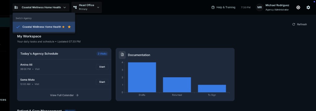
Screenshot 5: Agency selector dropdown showing current agency with checkmark and star
How to Switch Agencies
Step 1: Click on the agency name in the top-left of the header bar
Step 2: You'll see:
- "Switch Agency" label at top
- Current agency with:
- ✓ Blue checkmark - Currently selected
- ⭐ Star icon - Favorited agency (if applicable)
- List of other agencies you have access to
Step 3: Click on any agency name to switch to it
What Happens:
- System switches to the selected agency
- Dashboard refreshes with that agency's data
- All menus and features now show data for selected agency
- Green success notification appears (see Section 2.6)
Agency Selection Details
In the screenshot:
- "Coastal Wellness Home Health" is currently selected
- Blue checkmark (✓) indicates active agency
- Gold star (⭐) indicates this is a favorited/pinned agency
ℹ️ NOTE: If you only have access to one agency, this dropdown will not appear or will show only your agency without the ability to switch.
💡 TIP: If you frequently work with specific agencies, you can favorite them (star icon) for quick access.
2.6 Switching Branches (Multi-Location)
For agencies with multiple physical locations (branches), you can easily switch between them.
Branch Selector Dropdown
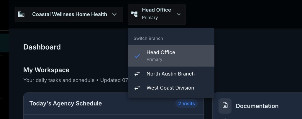
Screenshot 6: Branch selector showing Head Office and other branches
Understanding Branches
What is a Branch?
- A physical location of your agency
- Example: Main office, satellite offices, regional divisions
- Each branch can have its own:
- Staff assignments
- Patient assignments
- Service territory
- NPI (optional)
Branch Types:
- Primary - Your main/headquarters location
- Additional Branches - Satellite offices, regional divisions
How to Switch Branches
Step 1: Click on the branch name in the header bar (next to agency name)
In the screenshot, it shows:
- "Head Office"
- "Primary" (designation below)
Step 2: Dropdown opens showing:
- "Switch Branch" label at top
- Current branch with ✓ checkmark
- "Head Office" with "Primary" designation
- Other branches with switch icon (⇄)
- "North Austin Branch"
- "West Coast Division"
Step 3: Click on any branch to switch to it
What Happens When You Switch
When you select a different branch:
-
Data Filtering Changes
- Dashboard shows data for selected branch
- Patient lists filtered by branch
- Schedule shows branch's clinicians and visits
-
Success Notification Appears
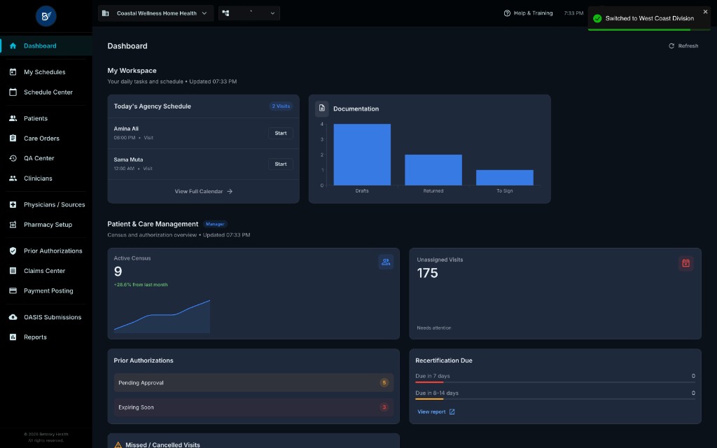
Screenshot 7: Green success notification showing "Switched to West Coast Division"
- Header Updates
- Branch name changes in header bar
- Shows the branch you switched to
Branch Permissions
⚠️ IMPORTANT: Branch access depends on your user permissions:
Agency Administrator:
- Can access ALL branches
- Can switch freely between any branch
- Can view agency-wide reports
Branch-Level Staff:
- Limited to assigned branch(es)
- May have access to multiple branches
- Cannot see data from unassigned branches
Single-Branch Users:
- Can only access their primary branch
- Branch selector may not appear
- Or shows only their branch with no switch option
💡 TIP: Branch filtering helps large agencies manage multiple locations efficiently. Each branch can operate semi-independently while rolling up to agency-wide reporting.
Branch Access Types
When users are assigned to branches, they have one of two access types:
ACTIVE Access:
- Can view and edit data for this branch
- Can schedule visits
- Can document visits
- Full operational access
READ_ONLY Access:
- Can view data only
- Cannot schedule or document
- Useful for managers overseeing multiple branches
ℹ️ NOTE: Branch assignment is configured in Settings → User Management when creating or editing users.
2.7 System Alerts & Toast Notifications
The system uses toast notifications to provide feedback on your actions.
What are Toast Notifications?
Toasts are temporary messages that appear briefly to confirm actions or show errors. They appear in the top-right corner of the screen and automatically disappear after a few seconds.
Types of Notifications
1. Success Notifications (Green)
Screenshot 7 (repeated): Success notification example
Appearance:
- ✅ Green background
- ✓ Checkmark icon
- White text
- Brief message
When You'll See Them:
- Successfully saved changes (agency settings, patient info, etc.)
- Created a new record (patient, care order, visit, etc.)
- Approved a document (QA workflow)
- Switched branches or agencies
- Completed an action (scheduled visit, posted payment, etc.)
Example Messages:
- "Switched to West Coast Division"
- "Agency information updated successfully"
- "Patient created successfully"
- "Visit scheduled"
- "Document approved"
2. Error Notifications (Red)
Appearance:
- ❌ Red background
- ✖️ X icon
- White text
- Error description
When You'll See Them:
- Form validation errors
- Required fields missing
- Cannot perform action (permissions, business rules)
- System errors
- Network issues
Example Messages:
- "Required fields are missing"
- "Cannot delete - record has dependencies"
- "Invalid date range"
- "Insufficient permissions"
3. Warning Notifications (Yellow/Orange)
Appearance:
- ⚠️ Yellow or orange background
- Warning icon
- Black or dark text
When You'll See Them:
- Cautions before destructive actions
- Important reminders
- Data quality warnings
- Configuration issues
Example Messages:
- "This action cannot be undone"
- "Care order expires in 5 days"
- "Missing authorization for this visit"
4. Info Notifications (Blue/Gray)
Appearance:
- ℹ️ Blue or gray background
- Info icon
- Informational message
When You'll See Them:
- General information
- Process updates
- Background task completion
- System updates
Example Messages:
- "Report generation in progress"
- "Data synced successfully"
- "Update available"
Toast Notification Behavior
Duration:
- Success messages: ~3 seconds
- Error messages: ~5 seconds (or until dismissed)
- Warnings: ~5 seconds
- Info: ~3 seconds
Dismissal:
- Auto-dismiss after duration
- Click X icon to dismiss immediately
- Click outside notification to dismiss
Location:
- Always appear in top-right corner
- Stack vertically if multiple appear
- Most recent on top
Multiple Notifications:
- Multiple toasts can appear simultaneously
- Each dismisses independently
- Maximum usually 3-4 visible at once
Toast Notification Examples by Action
| Action | Toast Type | Example Message |
|---|---|---|
| Save agency settings | ✅ Success | "Agency information updated successfully" |
| Create patient | ✅ Success | "Patient created successfully" |
| Approve QA document | ✅ Success | "Document approved" |
| Switch branch | ✅ Success | "Switched to West Coast Division" |
| Missing required field | ❌ Error | "Email is required" |
| Permission denied | ❌ Error | "You don't have permission to perform this action" |
| Delete with dependencies | ❌ Error | "Cannot delete - patient has active care orders" |
| Care order expiring soon | ⚠️ Warning | "Care order expires in 3 days - initiate recertification" |
| Missing authorization | ⚠️ Warning | "Visit exceeds authorized units" |
| System update available | ℹ️ Info | "System update completed - refresh page" |
Best Practices for Toast Notifications
💡 TIP: Pay attention to toast messages - they provide important feedback:
- ✅ Green = Your action succeeded
- ❌ Red = Something went wrong, read the message
- ⚠️ Yellow = Proceed with caution
- ℹ️ Blue = Good to know, but not urgent
⚠️ IMPORTANT: If you see an error toast, read it carefully. It usually explains exactly what went wrong and how to fix it.
Other Alert Types
In addition to toast notifications, the system uses:
1. Modal Dialogs
- Require user action (OK, Cancel, etc.)
- Block interaction until dismissed
- Used for confirmations and critical decisions
2. Inline Validation
- Red text below form fields
- Shows specific field errors
- Real-time feedback while typing
3. Banner Alerts
- Persistent messages at top of page
- Example: Sandbox Mode banner (orange)
- Remain visible until condition changes
4. Badge Counts
- Number indicators on menu items
- Example: "3" on QA Center = 3 pending reviews
- Shows count of items needing attention
2.8 Dashboard Quick Reference
Now that you understand navigation, here's a quick reference guide:
Essential Navigation Shortcuts
| Want to... | Click here... |
|---|---|
| Go to home/dashboard | 🏠 Dashboard in sidebar |
| Add a patient | 👥 Patients → Add Patient button |
| Schedule a visit | 📅 Schedule Center |
| Review documents | ✓ QA Center |
| View claims | 💰 Claims Center |
| Create OASIS | 📊 OASIS Submissions |
| Change settings | Click your name → Settings |
| Switch branch | Click branch name in header |
| Get help | 🎓 Help & Training in header |
| Log out | Click your name → Log Out |
Menu Item Deep Links
Each menu item takes you to a specific section:
Patient Management:
- 👥 Patients → Patient list and intake
- 📋 Care Orders → Episodes of care
- 📅 Schedule Center → Agency scheduling
Clinical Documentation:
- 📅 My Schedules → Your personal schedule (clinicians)
- ✓ QA Center → Document review queue
- 📊 OASIS Submissions → OASIS tracking
Setup & Configuration:
- 👨⚕️ Clinicians → Staff management
- 🏥 Physicians / Sources → Physician database
- 💊 Pharmacy Setup → Pharmacy list
Billing & Authorization:
- 📄 Prior Authorizations → PA management
- 💰 Claims Center → Claims and billing
- 💳 Payment Posting → Payment processing
Reporting:
- 📈 Reports → System reports and analytics
Visual Navigation Cues
Look for these visual indicators:
✓ Blue highlight - Current page in sidebar ⭐ Star icon - Favorited agency ✓ Checkmark - Currently selected (agency/branch) ⇄ Switch icon - Available to switch to 🔵 Blue badge - Notification count 🟢 Green toast - Success feedback 🔴 Red toast - Error feedback